
Mar 12
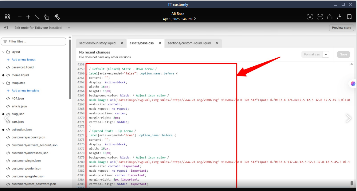
Add "+" (Open) and "-" (Close) Icons to Accordions in Options
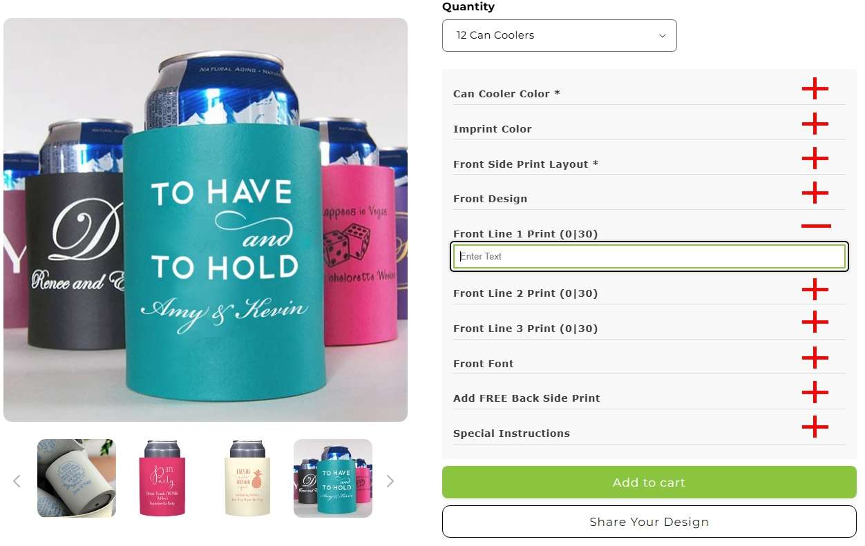
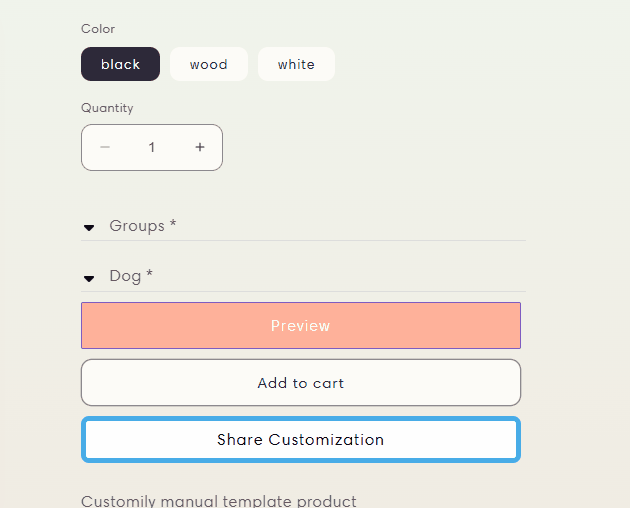
The "Accordions in Options" setting under "Styles" is a great feature for merchants who offer a lot of customization options.
The problem is when the "Accordions in Options" is activated, Their is no indicator to the customer that they need to click on each accordion to view and select the options for each accordion.
It would be a SUPERIOR experience if there were a "+" (plus) symbol on each accordian indicating the custom needs to click/tap to open. Once an accordion is open, a "-" (minus) symbol would appear indicating the customer can close the option to view all other option accordions again.
Pending
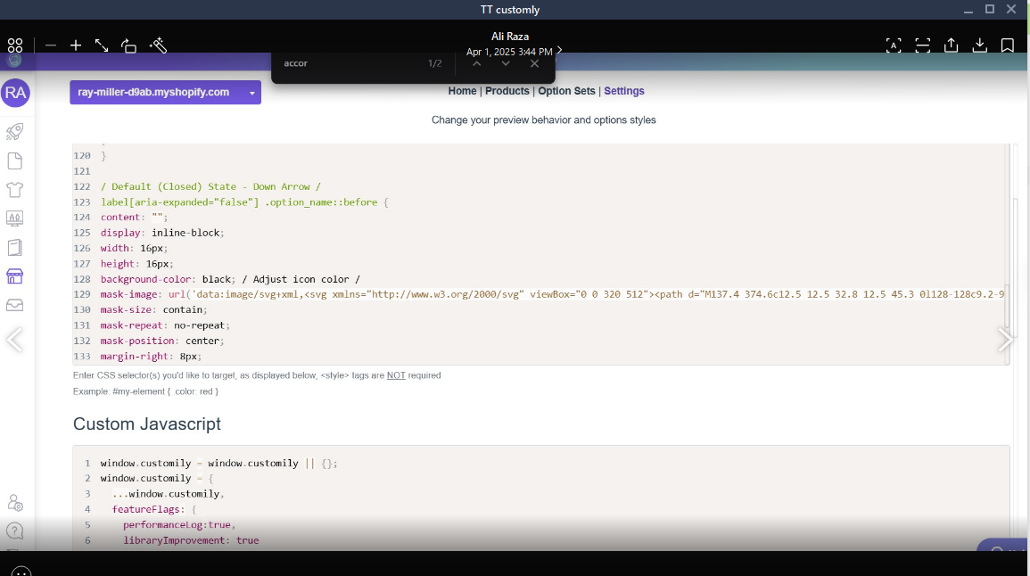
Is is okay if we enable the Accordian function on desktop to test or do you want us to wait until you look at mobile?