
Apr 4
Back Space on Personalization Widget
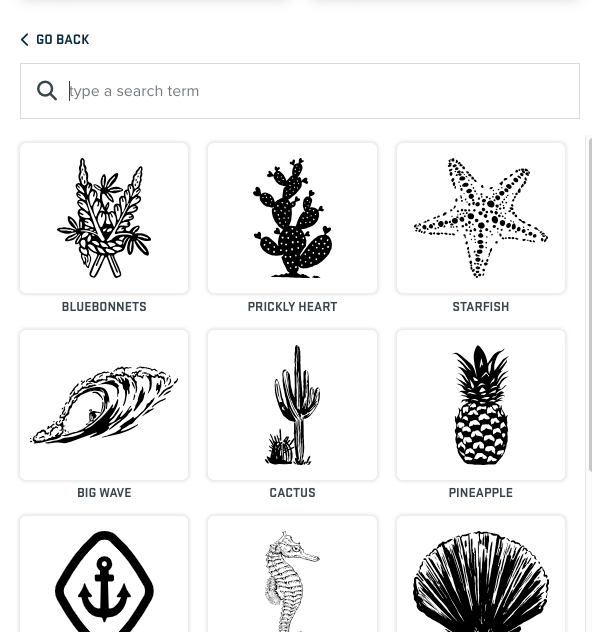
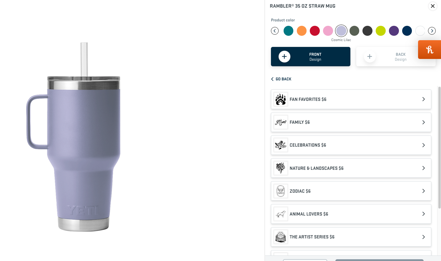
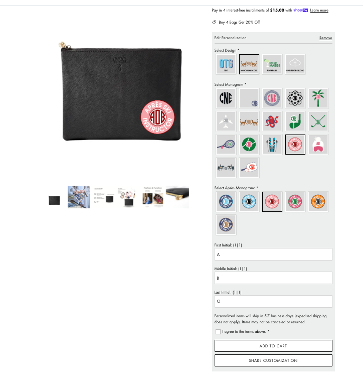
Our personalization widget online has categories customers can click into. It's very organized but when they click into each option the widget gets longer and longer making it hard to view the product and pick options, especially on mobile. It would be nice if once they clicked into a category (swatch) then the "select a design" swatches would go away so they can concentrate at the options at hand and could click a back button to view the original options. Hard to explain but hopefully you get the jist. Yeti does a good job of this so I provided an example of their "go back" button.
Pending