In-App Features

Add "+" (Open) and "-" (Close) Icons to Accordions in Options

2y agoPending

The "Accordions in Options" setting under "Styles" is a great feature for merchants who offer a lot of customization options.

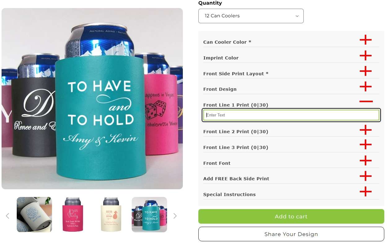
The problem is when the "Accordions in Options" is activated, Their is no indicator to the customer that they need to click on each accordion to view and select the options for each accordion.

It would be a SUPERIOR experience if there were a "+" (plus) symbol on each accordian indicating the custom needs to click/tap to open. Once an accordion is open, a "-" (minus) symbol would appear indicating the customer can close the option to view all other option accordions again.

  • img/b6j8qqm194sgjf3etqsv8l9m
and 4 others

7 comments

  1. Is is okay if we enable the Accordian function on desktop to test or do you want us to wait until you look at mobile?

    1. Ray Miller: I've just emailed you.

  2. Hi Augusto. Yes, it looks correct. However, it is not working on Mobile... only desktop.

  3. We also have added the css in shopify theme code and still it does not work.

    • img/xq71uk0sa7azy7rr1ouz23iz
  4. Hello Augusto. We added the code per your instructions and the dropdown arrows do not display.

    • img/9azq3rvn1dej7gd1i80u6ow6
    1. Hello Ray Miller ! I guess the CSS you've applied has a typo or something like that.

      We tweaked the CSS for you. Check it out and see if it looks correct in your storefront.

  5. Thanks for sharing. To achieve that, you can add icons via CSS in your store settings, as shown in the example below.

    The CSS used in this example is:

    /* Default (Closed) State - Down Arrow */

    label[aria-expanded="false"] .option_name::before {

    content: "";

    display: inline-block;

    width: 16px;

    height: 16px;

    background-color: black; /* Adjust icon color */

    mask-image: url('data:image/svg+xml,<svg xmlns="http://www.w3.org/2000/svg" viewBox="0 0 320 512"><path d="M137.4 374.6c12.5 12.5 32.8 12.5 45.3 0l128-128c9.2-9.2 11.9-22.9 6.9-34.9s-16.6-19.8-29.6-19.8L32 192c-12.9 0-24.6 7.8-29.6 19.8s-2.2 25.7 6.9 34.9l128 128z"/></svg>');

    mask-size: contain;

    mask-repeat: no-repeat;

    mask-position: center;

    margin-right: 8px;

    vertical-align: middle;

    }

    /* Opened State - Up Arrow */

    label[aria-expanded="true"] .option_name::before {

    content: "";

    display: inline-block;

    width: 16px;

    height: 16px;

    background-color: black; /* Adjust icon color */

    mask-image: url('data:image/svg+xml,<svg xmlns="http://www.w3.org/2000/svg" viewBox="0 0 320 512"><path d="M182.6 137.4c-12.5-12.5-32.8-12.5-45.3 0l-128 128c-9.2 9.2-11.9 22.9-6.9 34.9s16.6 19.8 29.6 19.8h256c12.9 0 24.6-7.8 29.6-19.8s2.2-25.7-6.9-34.9l-128-128z"/></svg>');

    mask-size: contain;

    mask-repeat: no-repeat;

    mask-position: center;

    margin-right: 8px;

    vertical-align: middle;

    }

    • img/xrb1b4bz9tqc9vtkyc4elw6o