We would like to suggest an improvement regarding the option removal experience. Currently, customers can remove a selected option by clicking the small "X" icon displayed on the design preview. However, in our setup, multiple options often share the same size and position, causing the "X" icons to overlap each other (as shown in the screenshot). This makes it difficult for customers to identify and remove the correct option. Additionally, the majority of our customers shop on mobile devices, where tapping small overlapping icons becomes even more challenging and can negatively impact the user experience. To improve usability, we would love to have the ability to add a "Remove/Clear Selection" option directly within the option selector itself (for example, as a dedicated choice inside the option list or swatches). This would allow customers to easily deselect an option without having to interact with the design preview. We believe this would provide a much more intuitive and mobile-friendly experience. Thank you for considering this enhancement. Best regards,
Thanks for the suggestion, that's a great idea! I'll review this with the team to see how we can make removing / clearing the selection more user friendly. I'll keep you posted
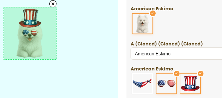
Hey! What were you using the Allow Multiple Selection for? This feature is currently only compatible with Dynamic Images, and they should have the Allow Swapping also selected on the Template, in the Image Bevahior Section. This is what allows users to swap between elements and DELETE them from the selection. Here's the changelog post for more information: https://customily.userjot.com/updates/p/multi-image-control-…